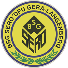
Why Do All East-German Football Crests Look Similar?
After linking to a list of East-German football logos, I went to find the crest of the club I played for in the late 1980s as an eight year old. Of course I found it; thank you, internet.

Many East-German football logos have a similar visual language. Vibrant, contrasting colours, hand-lettering, minimalist designs. The predominant visual style of the 1950s and 1960s.
A theory why this style is so common: After the end of World War II and the founding of the GDR, all existing sports clubs were dissolved and re-established. Teams were assigned to a state-owned industrial factory or workshop to bring them under the control of the new socialist regime and to rid them of fascist thinking. And so these new clubs needed new logos. Since the clubs were established around the same time, the new crests were too, in the 1950s and 1960s. Today they represent the zeitgeist of a specific time.
And just like these beautiful crests appeared at the same time, they all disappeared in the early nineties after Germany’s reunification, when the club’s names and associations changed again to rid them of any communist influence.