— 100 visualisations for the same simple dataset, along with a short discussion of pros and cons for each variation. Great resource.
Posts about Data Visualisation (RSS, JSON)
Wednesday, 13 November 2024
— Is the Love Song Dying? From the Pudding, a visual exploration of the evolution of love in popular music.
The love song didn’t die; it evolved. People are loving, losing, and connecting in more ways than ever before. We argue that modern pop is just as love-struck as ever
Side note: Betteridge’s law of headlines proven correct again.
Tuesday, 25 July 2023
— Visualisations of traffic, posts, and votes on StackOverflow show a steady decline in user activity on the site in the past three years. My theory: Content farms like dev.to have been flooding the Web, taking over top results on Google, and leading to less traffic on StackOverflow.
Friday, 09 June 2023
— Where can you get within 40 minutes from every subway station in New York? Chris Whong’s fun, interactive map shows you, using GTFS data from New York’s Metropolitan Transportation Authority.
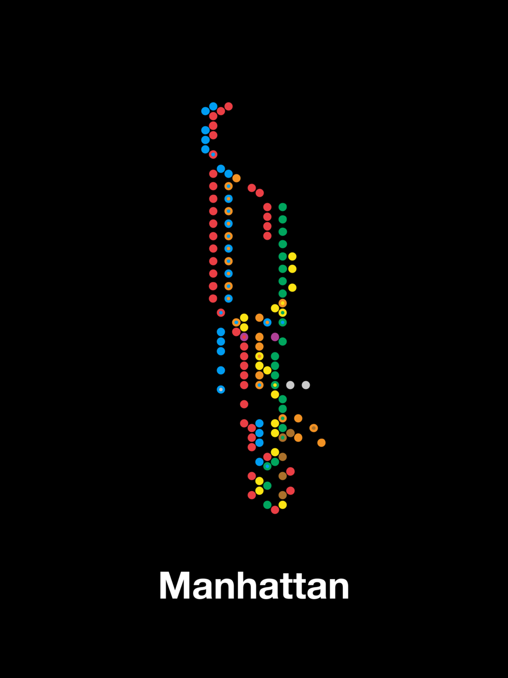
These minimalist graphics and maps from Peter Gorman are awesome.
Thursday, 27 April 2023
— Five ground-breaking data visualisations, including John Snow, Florence Nightingale, and W.E.B DuBois.
Saturday, 01 April 2023

This map shows the outlines of atlases created on Field Papers. Mundane data made to look like art. (via)
Thursday, 30 March 2023
— The physics of cycling explained in one grand article with grand, interactive visualisations.
Sunday, 19 March 2023
Thursday, 08 December 2022
— The most popular social networks by monthly active users since 2004, animated.
I had never heard of Hi5 before, or Qzone, which had over 650 million active users in 2014. (via Waxy)
Wednesday, 30 November 2022
— The world-class New York Times graphics department designed charts depicting the scenarios under which each team will advance to the knock-out stage of the Football World Cup.